The Winning Seat®
Mobile Live-Action Sports Sweepstake App & AdTech Platform
I was brought on by TLS Holdings Inc. as a UX Consultant to provide feedback and insight for a new mobile app that they had recently released. Shortly after coming on board, I was asked to redesign the app based on the user research gathered and stakeholders' goals. I served as the lead designer on the project collaborating with an in-house marketing team, engineers, product managers and business stakeholders to design a dual-purpose app that serves as a fun, engaging experience for users as well as a place where small to medium sized businesses can market themselves locally and affordably. The new design is still being developed and expected to launch in September 2023.
Senior UX Designer | Scheduled Release 2024
User Personas
We wanted to form a deeper understanding of our target users as well as their goals, needs, interests and influences. This was a key component in our design process in order to set aside our personal, potentially biased, opinions when it came to the functionality and the design of the app. Using qualitative and statistical data, we defined our user base into 3 main market segments which we referred to whenever we wanted to step out of ourselves and our initial ideas and reconsider our target markets' motivations. We kept these persona groups somewhat generic in order to avoid jumping to any potentially biased conclusions based on age or gender when interpreting personas.
-
Motivation: Turn passion and knowledge into winnings
Story: This fanatic wants to further elevate their live-action experience and competitive edge by waging bets against their friends, winning prizes and gaining bragging rights.
Conversion Method: Increase number of live-action events, Introduce in-app wagers among members
-
Motivation: Curiosity, Increase Knowledge/Interaction, Prizes & Offers
Story: This casual fan loves a good game of chance and any opportunity to win some prizes while their partner yells at the tv.
Conversion Method: Free Platform, Simple UI/UX
-
Motivation: Root for their team, the thrill of winning, save money, support local
Story: Whether their team or alma mater is playing or not, they represent the biggest redemption ratio, being the most likely demographic to cash in their offers at local businesses. Got to save some money towards student loans.
Conversion Method: More win opportunities, daily check-ins for local offers
User Journey
To further simplify the path taken by our prototypical users, we created a flow chart to illustrate their journey . While doing so, we found a couple potential road blocks that we were able to eliminate in order to simplify navigation and reduce possible pain points. This user flow serves as a visual representation following every step from the onboarding process of the app to redeeming an offer or prize.

Wireframes
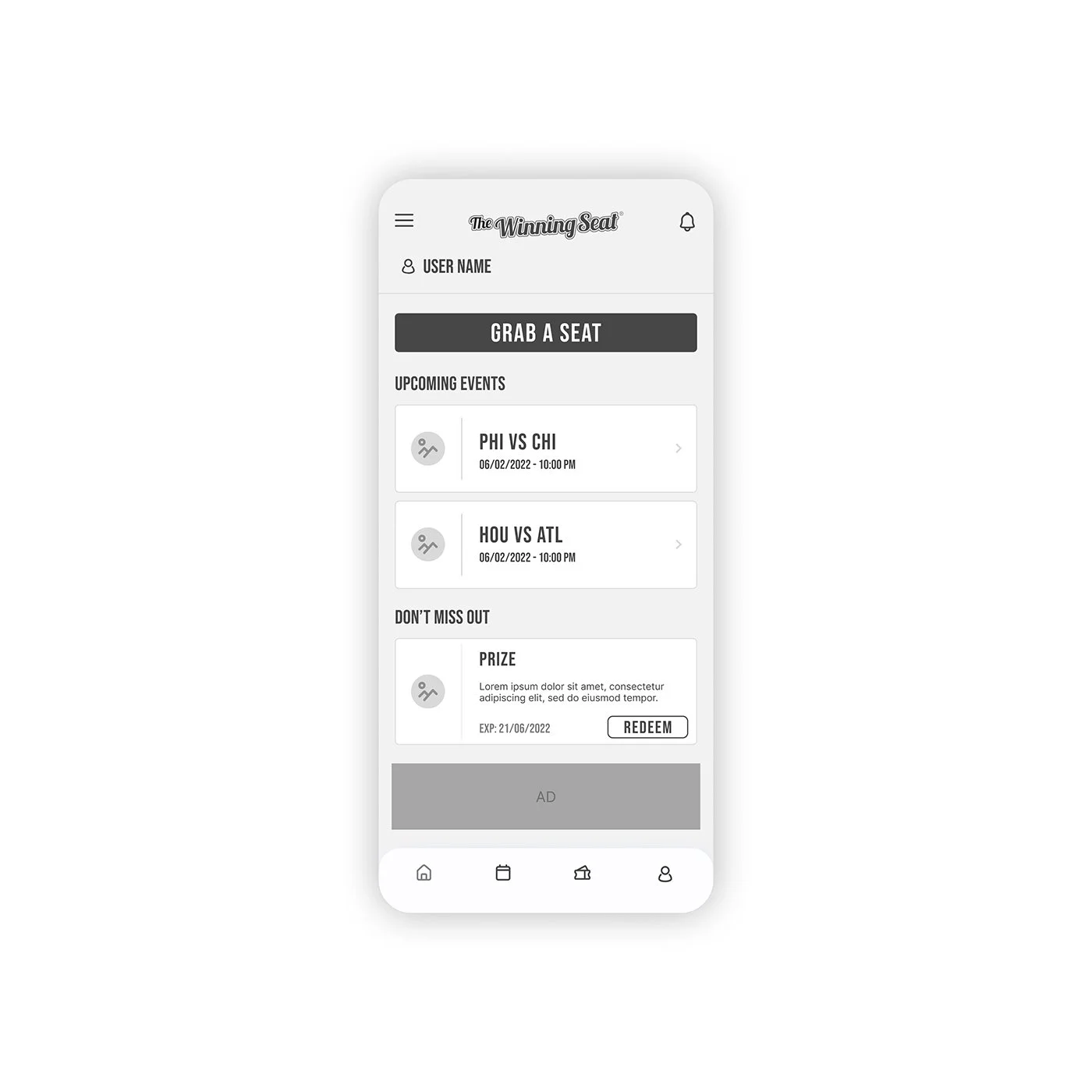
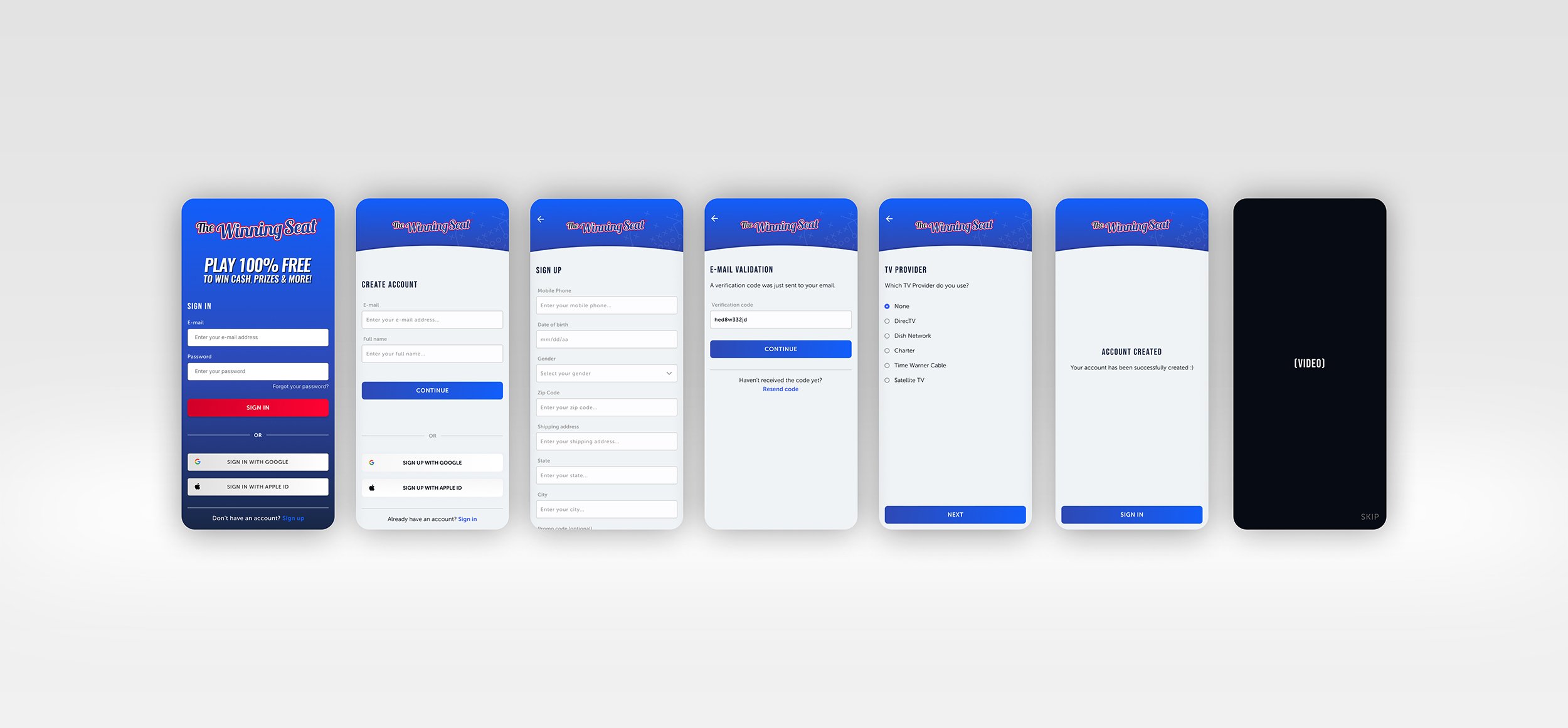
After drawing up a few initial sketches for each of the main screens, we reviewed them as a team, selected our favorite elements and decided on a design direction. I transferred my initial sketches into a few low-fidelity wireframes to represent the main screens within the app, adding relevant stock icons, imagery and copy as placeholders. At this stage, the wireframes were defined enough for some usability testing administered by our engineers. I made the necessary alterations to the design based on our findings and moved on to creating high-fidelity prototypes.
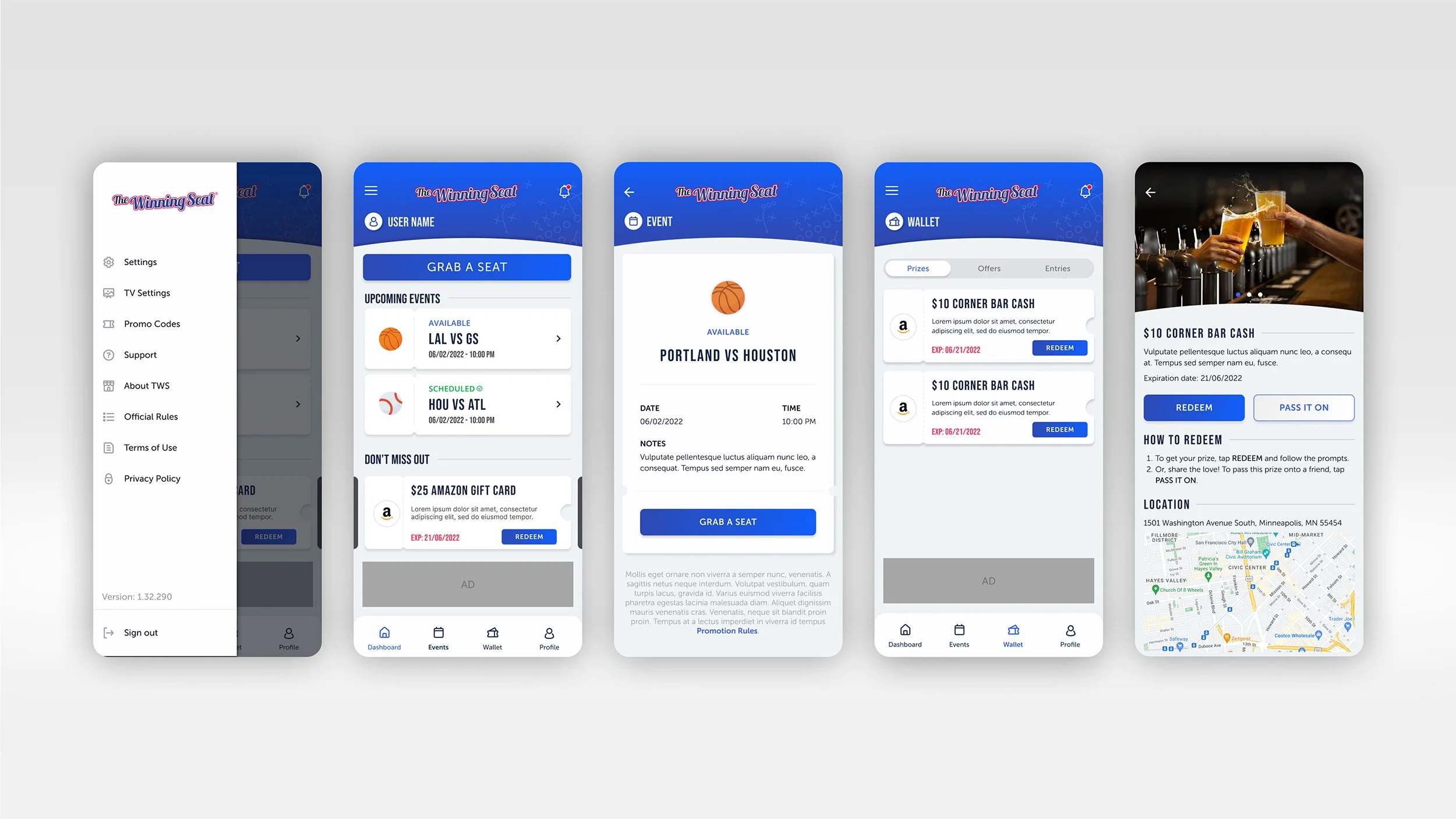
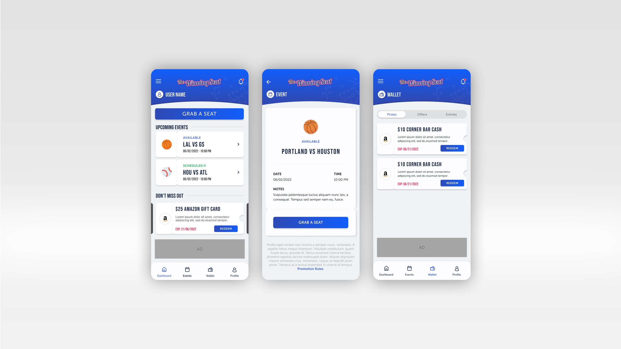
UI Design
Once the usability issues were resolved, I created the first round of high-fidelity designs in Figma. The user feedback we received suggested that the original design of the app was in need of an aesthetic refresh to elevate the brand identity and better reach our biggest user base, which we were surprised to discover was women between the ages of 35-50. My goal was to create a fun and engaging design that felt entirely gender-neutral, a detail that had been neglected in the beta design due to the nature of the app. We ended up with a soft, sporty grey background and a vibrant pop of primary colors for the palette. The implementation of unique shapes, identifiable icons and three-dimensional assets brought a playful, interactive element to the design to encourage in-app engagement and easy exploration. I also included a simplified bottom navigation bar providing shortcuts to the most popular screens to improve accessibility.